Picker in SwiftUI
What is a Picker?
Picker is a control for selecting an item from a collection.
Available iOS 13+, macOS 10.15+, Mac Catalyst 13.0+, tvOS 13.0+, watchOS 6.0+.
Let’s consider a picker for choosing coffee types from a code perspective:
import SwiftUI
struct CoffeeView: View {
// 1
private let coffee = ["Espresso", "Latte", "Cappuccino", "Americano"]
// 2
@State private var selectedCoffee = ""
var body: some View {
VStack {
// 3
Picker("Please choose a coffee", selection: $selectedCoffee) {
ForEach(coffee, id: \.self) {
Text($0)
}
}
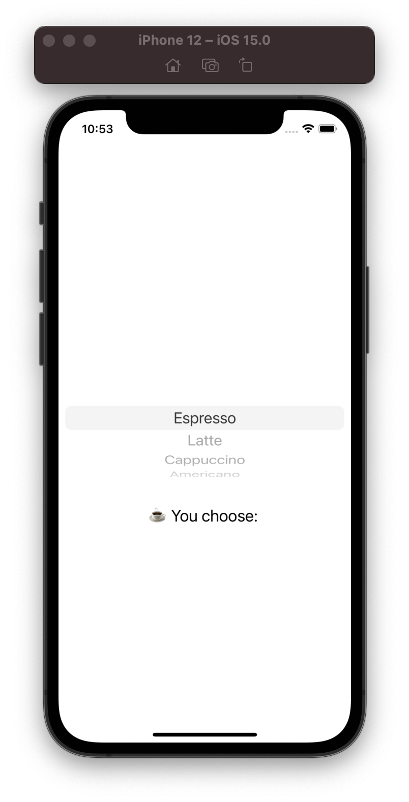
.pickerStyle(.wheel) // 4
// 5
Text("☕ You choose: \(selectedCoffee)")
.font(.title2)
}
}
}
- Data source collection for the Picker.
- Property for getting/setting the selected item from the Picker.
- Picker ;)
- Apply wheel style for the picker. All picker styles are described in the paragraph below.
- Simple
Textview displays the selected coffee type ☕.
Result:
Creating a Picker
Picker view has 3 init methods. Let’s consider each of them:
init(_ titleKey: LocalizedStringKey, selection: Binding<SelectionValue>, content: () -> Content)
Parameters:
- titleKey - A localized string key that describes the purpose of selecting an item.
- selection - A binding to a property that determines the currently-selected item.
- content - A view that contains the collection of items.
Selection property has two-way binding:
- The selection property is updated when the user selects an item in the picker.
- You can change the property from the code and set a value. Picker will be synced and updated with the selected item.
init(selection: Binding<SelectionValue>, content: () -> Content, label: () -> Label)
Parameters:
- label - A view that describes the purpose of selecting an item.
init<S>(_ title: S, selection: Binding<SelectionValue>, content: () -> Content) where S : StringProtocol
Parameters:
- title - A string that describes the purpose of selecting an item.
Picker Style
Let’s look at all the picker styles. The first thing you should know is the appearance of the picker style may depend on the type of container. The second thing is you should check is it available style for your platform or not.
Automatic Style
Automatic is the default picker style. The default picker styles by platform are:
- on iOS and watchOS the default is a wheel.
- on macOS the default is a pop-up button.
- on tvOS the default is a segmented control.
But is not exactly true. The default picker style may also take into account other factors — like whether the picker appears in a container view — when setting the appearance of apicker. What’s mean? I do not recommend to use automatic style. In my opinion, the best way is to explicitly define a specific style that best suits your task.
struct CoffeeView: View {

    private let coffee = ["Espresso", "Latte", "Cappuccino", "Americano"]

    @State private var selectedCoffee = ""

    var body: some View {
        Picker("Please choose a coffee", selection: $selectedCoffee) {
            ForEach(coffee, id: \.self) {
                Text($0)
            }
        }
        .pickerStyle(.automatic)
    }
}
Picker in VStack Container
struct CoffeeView: View {

    private let coffee = ["Espresso", "Latte", "Cappuccino", "Americano"]

    @State private var selectedCoffee = ""

    var body: some View {
        VStack {
            Picker("Please choose a coffee", selection: $selectedCoffee) {
                ForEach(coffee, id: \.self) {
                    Text($0)
                }
            }.pickerStyle(.automatic)
            Text("☕ You choose: \(selectedCoffee)")
                .font(.title2)
        }
    }
}
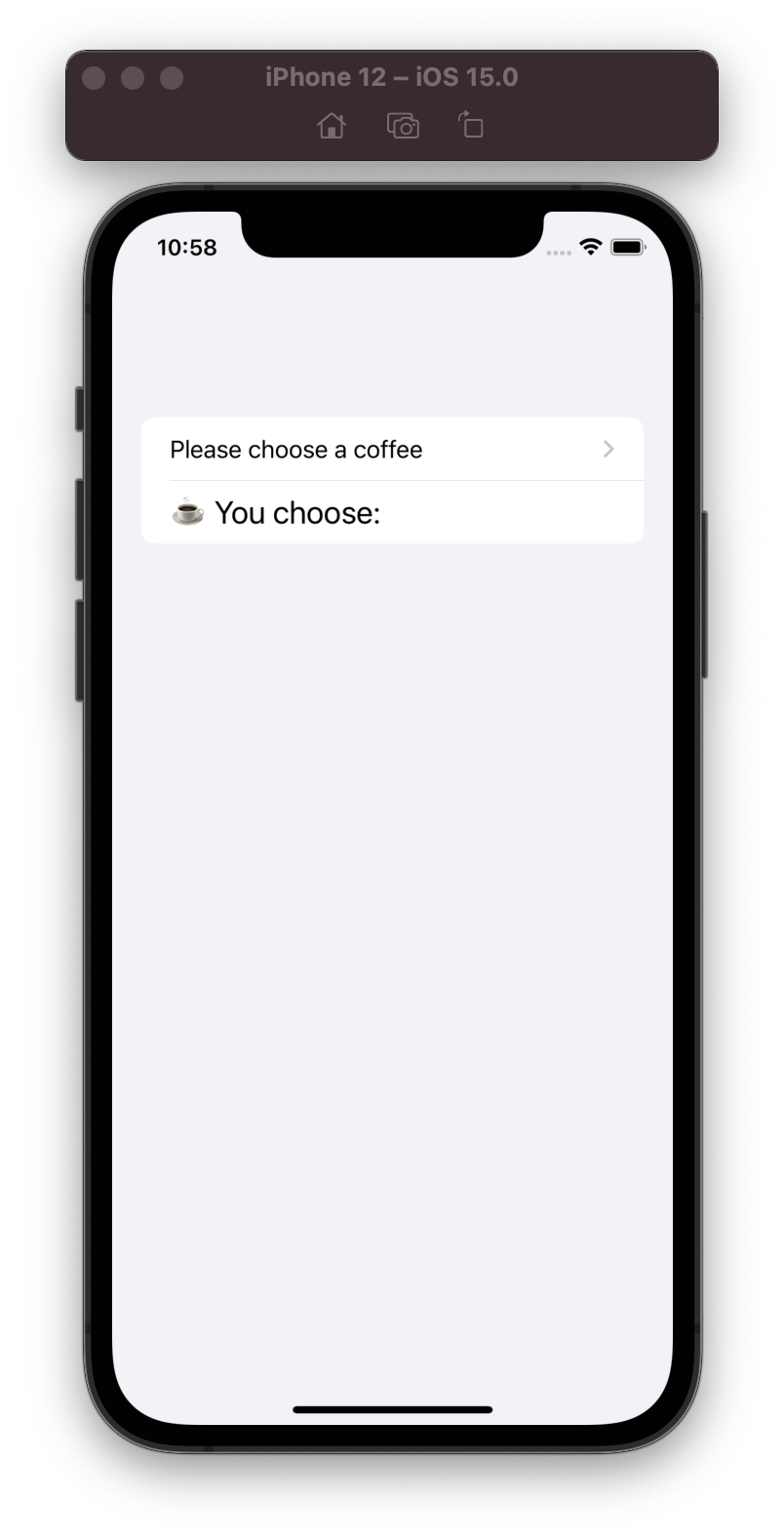
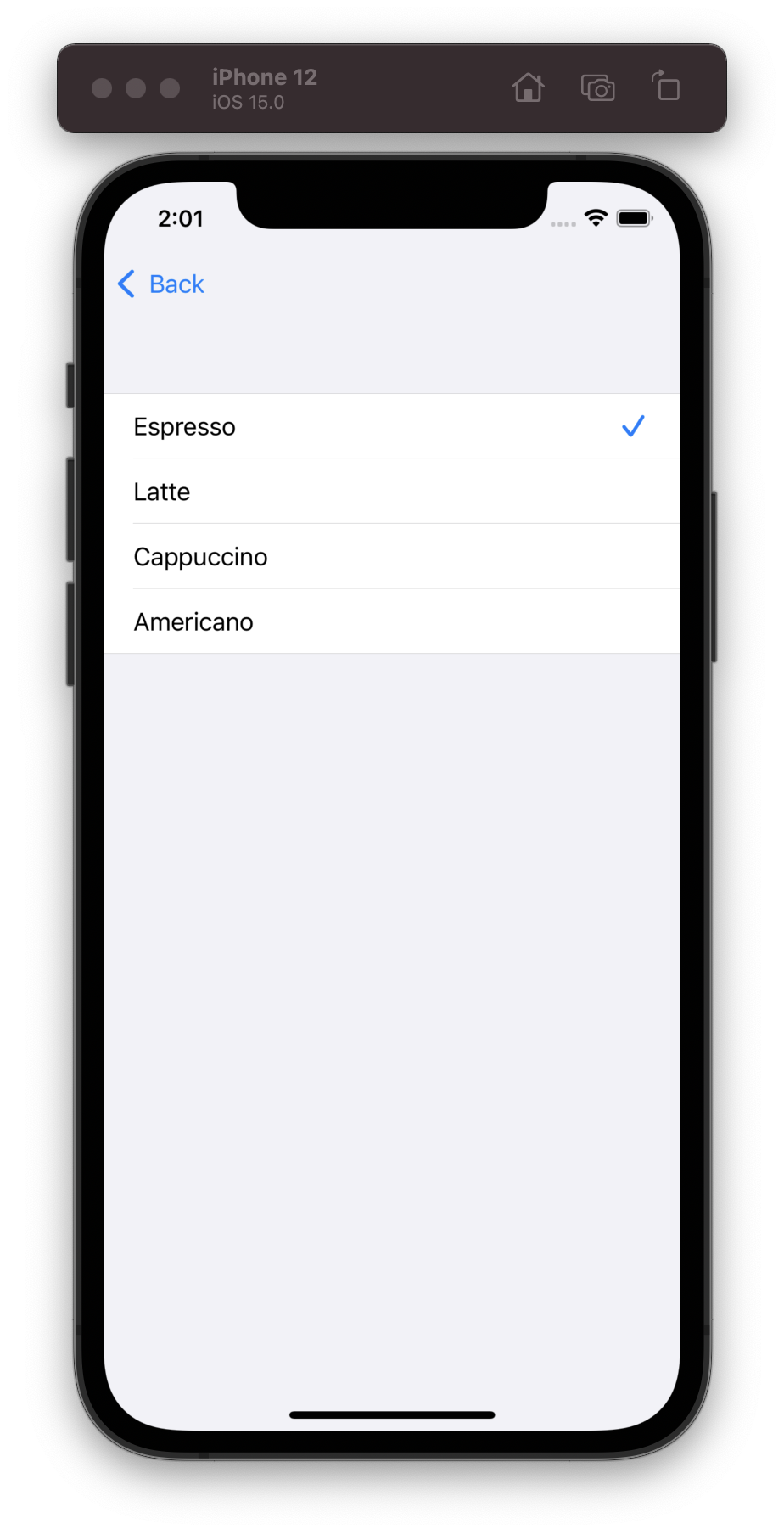
Picker in Form Container
struct CoffeeView: View {

    private let coffee = ["Espresso", "Latte", "Cappuccino", "Americano"]

    @State private var selectedCoffee = ""

    var body: some View {
        NavigationView {
            Form {
                Picker("Please choose a coffee", selection: $selectedCoffee) {
                    ForEach(coffee, id: \.self) {
                        Text($0)
                    }
                }.pickerStyle(.automatic)
                Text("☕ You choose: \(selectedCoffee)")
                    .font(.title2)
            }
        }
    }
}
Present 2 screen. When tap on picker, opens screen for select coffee item.
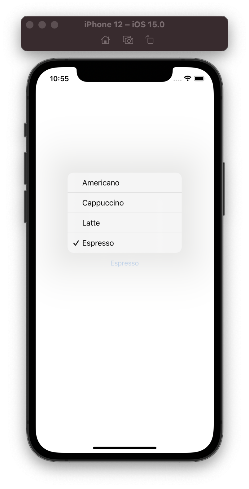
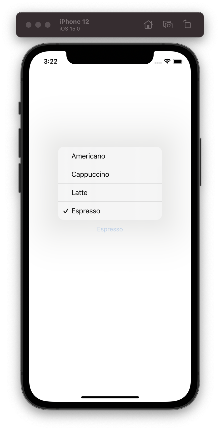
Menu Style
Menu style is presenting the items as a menu when pressed a button.
Available iOS 14.0+, macOS 11.0+, Mac Catalyst 14.0+.
struct CoffeeView: View {

    private let coffee = ["Espresso", "Latte", "Cappuccino", "Americano"]

    @State private var selectedCoffee = ""

    var body: some View {
        Picker("Please choose a coffee", selection: $selectedCoffee) {
            ForEach(coffee, id: \.self) {
                Text($0)
            }
        }.pickerStyle(.menu)
    }
}
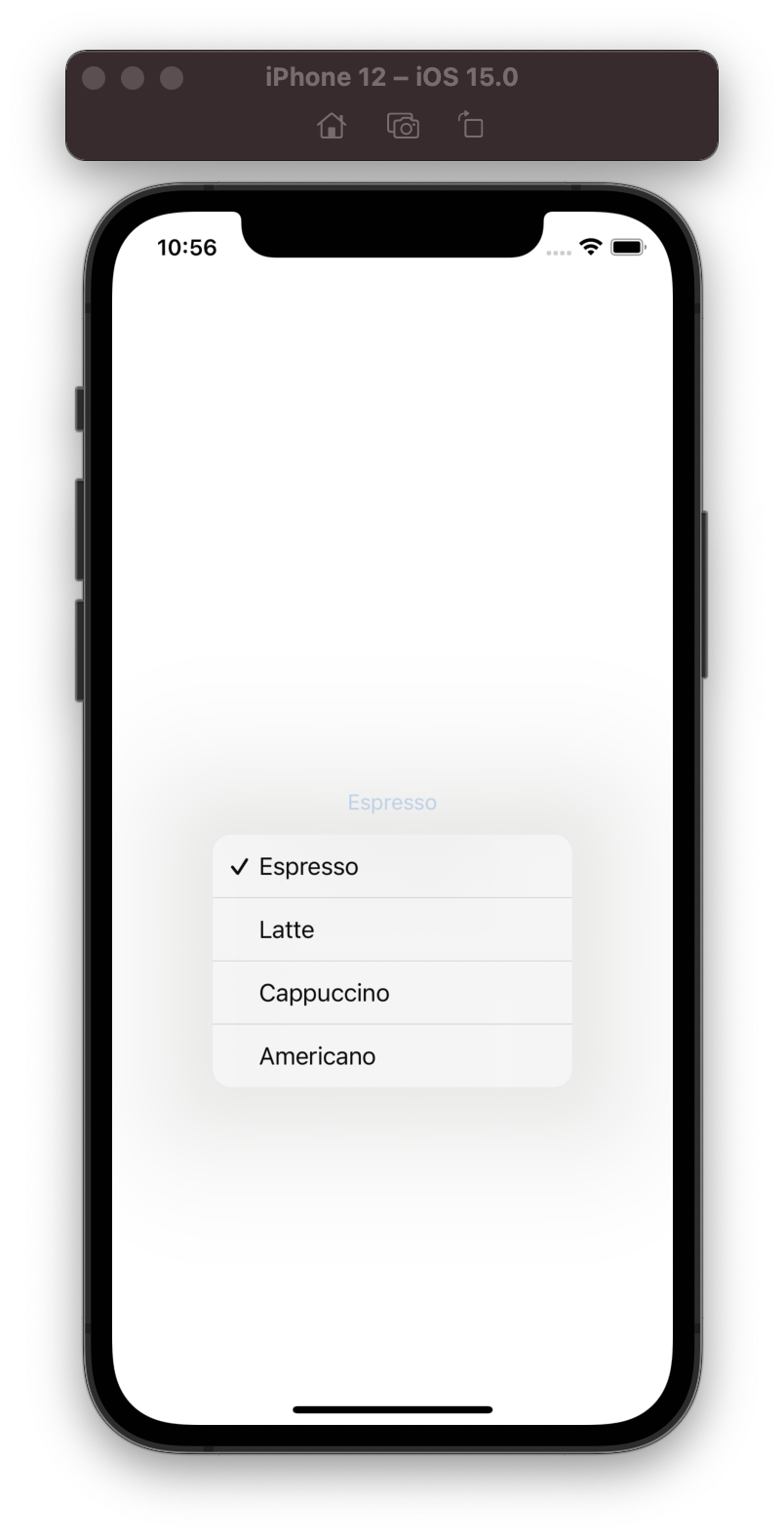
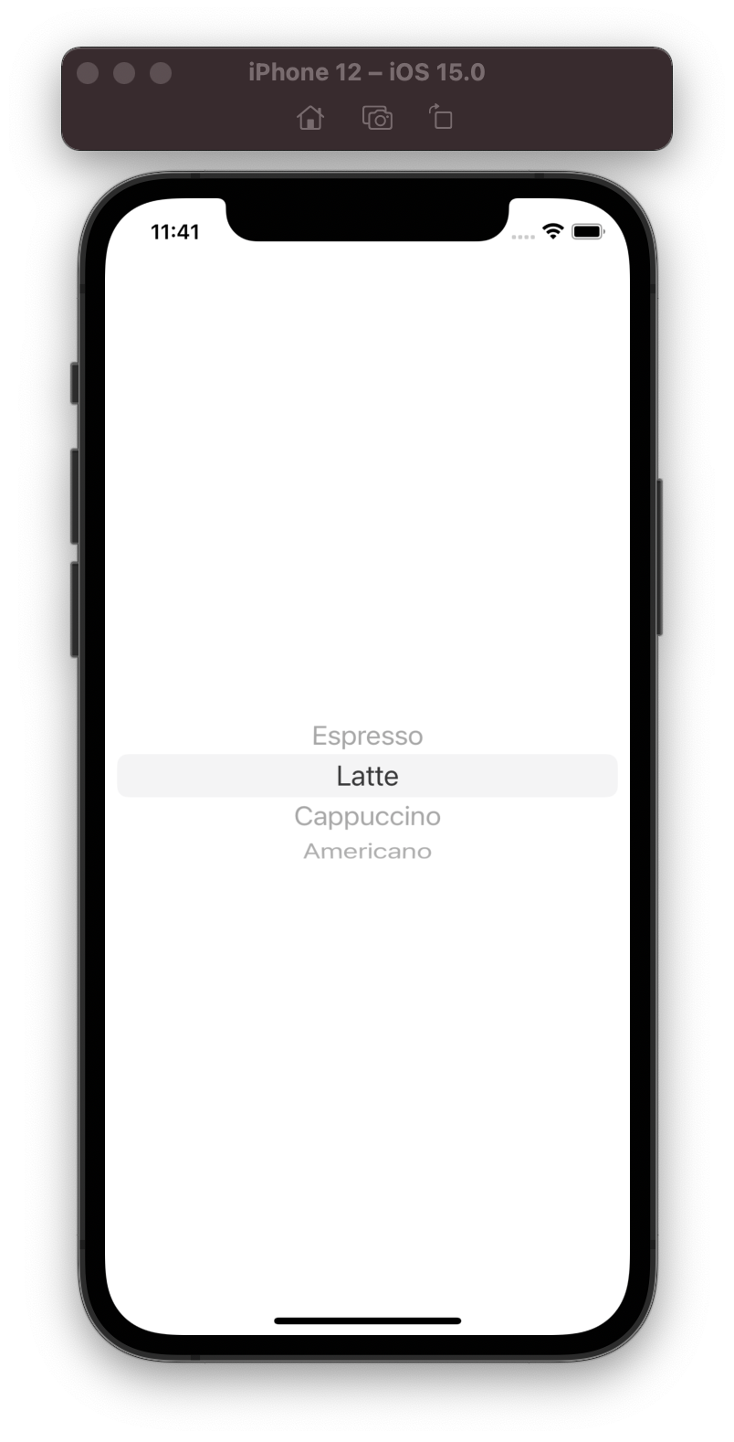
Wheel Style
A style presents the items in a scrollable wheel.
Available iOS 13.0+, Mac Catalyst 13.0+, watchOS 6.0+.
struct CoffeeView: View {

    private let coffee = ["Espresso", "Latte", "Cappuccino", "Americano"]

    @State private var selectedCoffee = ""

    var body: some View {
        Picker("Please choose a coffee", selection: $selectedCoffee) {
            ForEach(coffee, id: \.self) {
                Text($0)
            }
        }.pickerStyle(.wheel)
    }
}
Inline Style
A style each item is displayed inline with other views in the current container.
Available iOS 14.0+, macOS 11.0+, Mac Catalyst 14.0+, tvOS 14.0+, watchOS 7.0+.
struct CoffeeView: View {

    private let coffee = ["Espresso", "Latte", "Cappuccino", "Americano"]

    @State private var selectedCoffee = ""

    var body: some View {
        Picker("Please choose a coffee", selection: $selectedCoffee) {
            ForEach(coffee, id: \.self) {
                Text($0)
            }
        }.pickerStyle(.inline)
    }
}
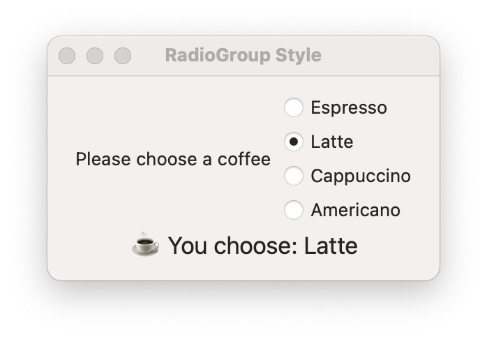
RadioGroup Style
A RadioGroup style presents the items as a group of radio buttons. Use this style when there are two to five items. Consider using Menu style when there are more than five items.
Available only macOS 10.15+.
struct CoffeeView: View {

    private let coffee = ["Espresso", "Latte", "Cappuccino", "Americano"]

    @State private var selectedCoffee = ""

    var body: some View {
        VStack {
            Picker("Please choose a coffee", selection: $selectedCoffee) {
                ForEach(coffee, id: \.self) {
                    Text($0)
                }
            }.pickerStyle(RadioGroupPickerStyle())
            Text("☕ You choose: \(selectedCoffee)")
                .font(.title2)
        }.padding()
    }
}
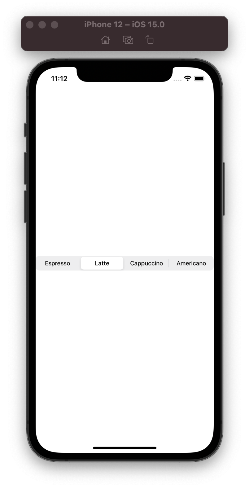
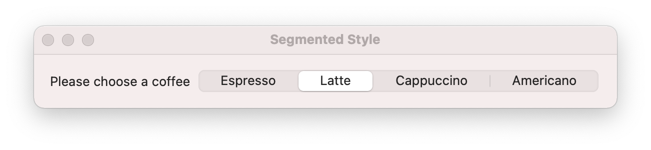
Segmented Style
A RadioGroup style presents the items as a group of radio buttons. Use this style when there are two to five items. Consider using Menu style when there are more than five items.
Available iOS 13.0+, macOS 10.15+, Mac Catalyst 13.0+, tvOS 13.0+.
struct CoffeeView: View {

    private let coffee = ["Espresso", "Latte", "Cappuccino", "Americano"]

    @State private var selectedCoffee = ""

    var body: some View {
        Picker("Please choose a coffee", selection: $selectedCoffee) {
            ForEach(coffee, id: \.self) {
                Text($0)
            }
        }.pickerStyle(.segmented)
    }
}
Thanks for reading! See you soon. 👋